Why Maps Leave Some Things Out
Why maps leave some things out: learn to read scale, symbols, labels, and omissions so you can judge what a map can—and cannot—tell you.
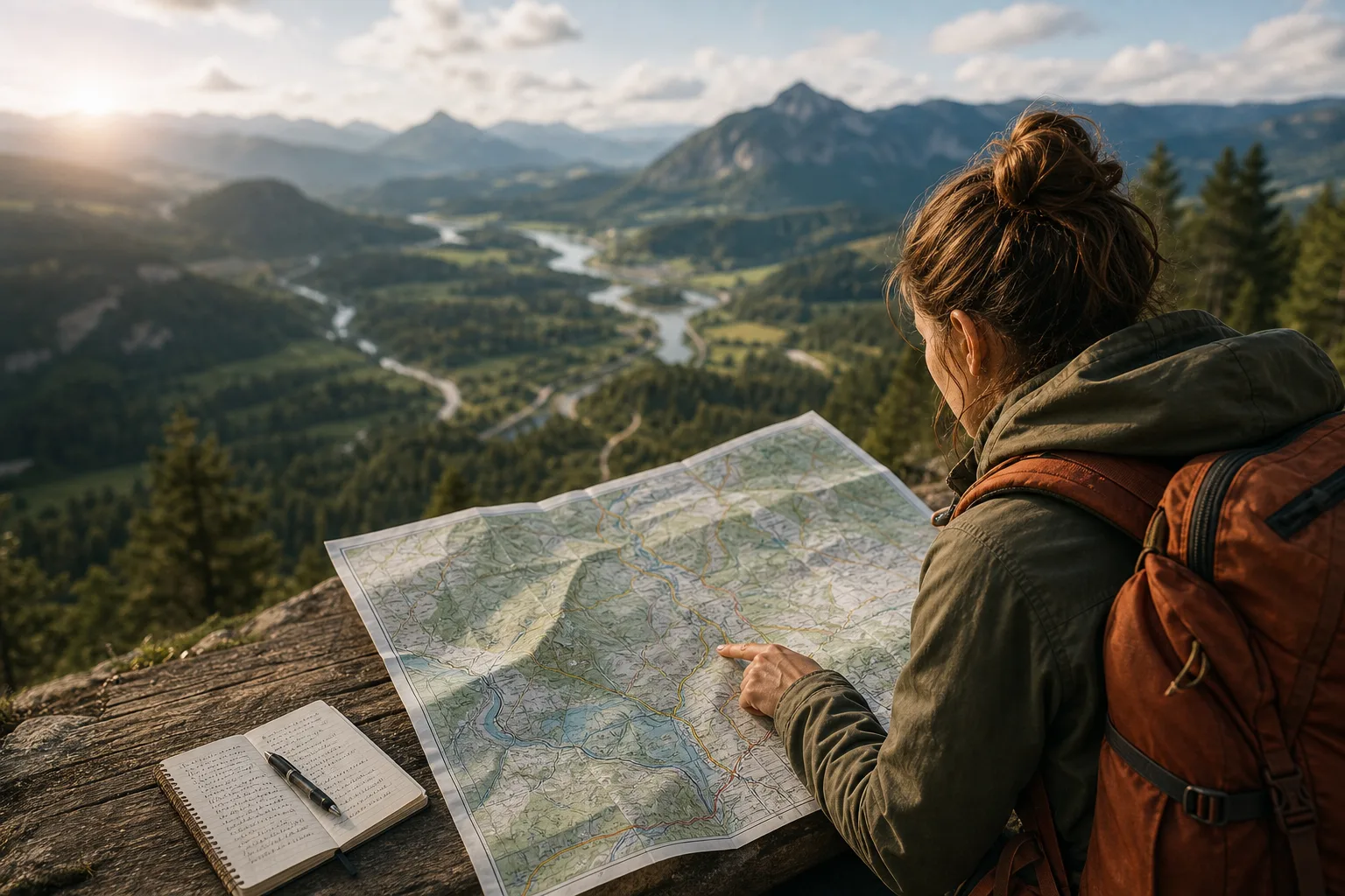
The most common mistake in reading a map is treating it as a smaller copy of a place. That can send you toward a road that is closed, past a landmark that is missing, or into a neighborhood the map barely describes. To understand why maps leave some things out, read them as designed selections: useful views built for particular purposes, not complete inventories of the world.
What job was this map made to do?
Start with the title, publisher, date, and any notes around the map. A subway map, a hiking map, and a city zoning map can show the same area while answering very different questions. One emphasizes routes and stations; another marks trails, elevation, and water; the third distinguishes land uses.
Ask who is expected to use the map and what decision it supports. A visitor map may enlarge a station or cluster attractions for legibility. A road map may prioritize drivable connections while leaving out footpaths. Neither choice makes the map inherently wrong. Each tells you what its maker considered useful for the intended reader.
Check the date, too. Roads, boundaries, transit lines, and place names can change. If the map has no date, treat current details with caution, especially when the information affects a route or access.
How much detail can the scale carry?
Find the scale bar or representative fraction, if one is provided. A map showing a large region on one page has less room for local detail than a street map of a small area. At a broad scale, small buildings, bends in a path, and minor streams may disappear. At a closer scale, more features can be drawn, though the map still has to choose what deserves space.
Scale also changes what a symbol can mean. A thick line might represent a highway on a regional map, while a similar-looking line on a neighborhood map could mark a boundary or a major street. Read the legend rather than relying on a symbol’s appearance alone.
Look for generalization: straightened curves, simplified coastlines, or gaps between nearby roads. These are ways to keep a map readable. They preserve a broad pattern while sacrificing some local precision, so do not use a small-scale map to judge the exact position of a feature.
What do the symbols and labels emphasize?
Read the legend before interpreting color or line style. A blue area may mean water, a protected zone, or something else defined by the mapmaker. A dotted line might mark a trail, a proposed route, or a boundary. The legend turns visual choices into an explicit set of meanings.
Then notice what receives the strongest visual treatment. Large lettering, bright colors, and heavy lines attract attention; faint marks recede. This hierarchy is a form of emphasis. A tourist map may give landmarks prominent labels while rendering residential streets lightly. A transit diagram may make transfers easy to see even when distances and directions are distorted.
Labels introduce further choices. Names may follow a local language, an official administrative form, or a historical convention. Some features receive labels while others remain anonymous. If a place matters to your question, compare the label with another source rather than assuming that an unlabeled feature is unimportant or unnamed.
Which omissions matter for your question?
Make a short list of what you need to know before trusting the map. A traveler may need current access, surface conditions, and a safe crossing. A student studying political boundaries may need the map’s date, source, and definitions. The relevant omissions depend on the task.
- For a route: check whether the map distinguishes public roads from private roads, trails, and restricted access.
- For terrain: look for contour lines, elevation shading, water crossings, and notes about the kind of ground shown.
- For boundaries: identify what each line represents and whether it marks an official, disputed, or informal division.
- For place names: check spelling, language, date, and whether alternate names appear elsewhere on the map.
- For current conditions: compare the map with a recent local notice, agency map, or sign on the ground.
Say you are planning a walk using a printed park map. It shows a footbridge over a creek, but the map’s date is old and no access note appears. You check the park department’s current trail notice before setting out; if it reports a closure, you choose a mapped alternative and confirm that route is open. The useful result is not certainty from one map, but a decision informed by the gap between its picture and present conditions.
How can you compare maps without confusing them?
When two maps disagree, first compare their purposes, dates, scales, and legends. A planning map may show a proposed road, while a navigation map shows roads open to traffic. A boundary may appear in different places because one map is generalized or uses a different definition.
Keep the comparison focused. Choose one feature, such as a river crossing or neighborhood boundary, and trace how each map represents it. Note what is included, omitted, renamed, or drawn differently. If the decision has practical consequences, consult the organization responsible for that information rather than treating either image as the final authority.
What questions help you read a map more carefully?
Why are some roads missing from a map?
The map may be designed for a different scale or purpose, or the roads may be private, minor, new, or outside its coverage. Check the legend, date, and a more detailed local source before relying on a missing road.
Does a map’s scale tell me how accurate it is?
Scale describes the relationship between map distance and ground distance; it does not, by itself, establish how current or precise every feature is. Use the scale to judge the level of detail the map can reasonably show.
Why do map distances sometimes look wrong?
Some maps distort direction, spacing, or area to make routes and connections easier to read. A transit diagram, for instance, may arrange stations clearly rather than preserve their exact geographic positions.
How can I tell whether a map is up to date?
Look for a publication or revision date and identify who maintains the information. For changing conditions, check a current source from the relevant city, park, transit agency, or land manager.
What should you carry forward?
Before using a map, name the question you want it to answer, then inspect its purpose, scale, legend, labels, and date. Consider which missing details could change your decision. If the stakes are practical, verify those details with a current source or on-site information.
Understanding why maps leave some things out makes their omissions easier to notice without dismissing the map itself. A map can still be an excellent tool when you know what its symbols promise, what its design prioritizes, and where another source needs to fill the gaps.